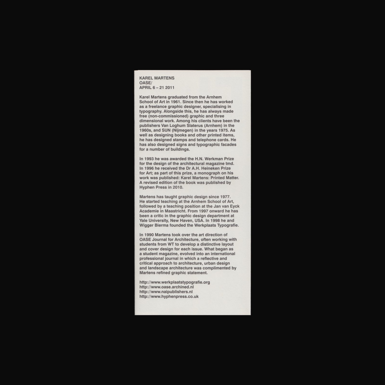
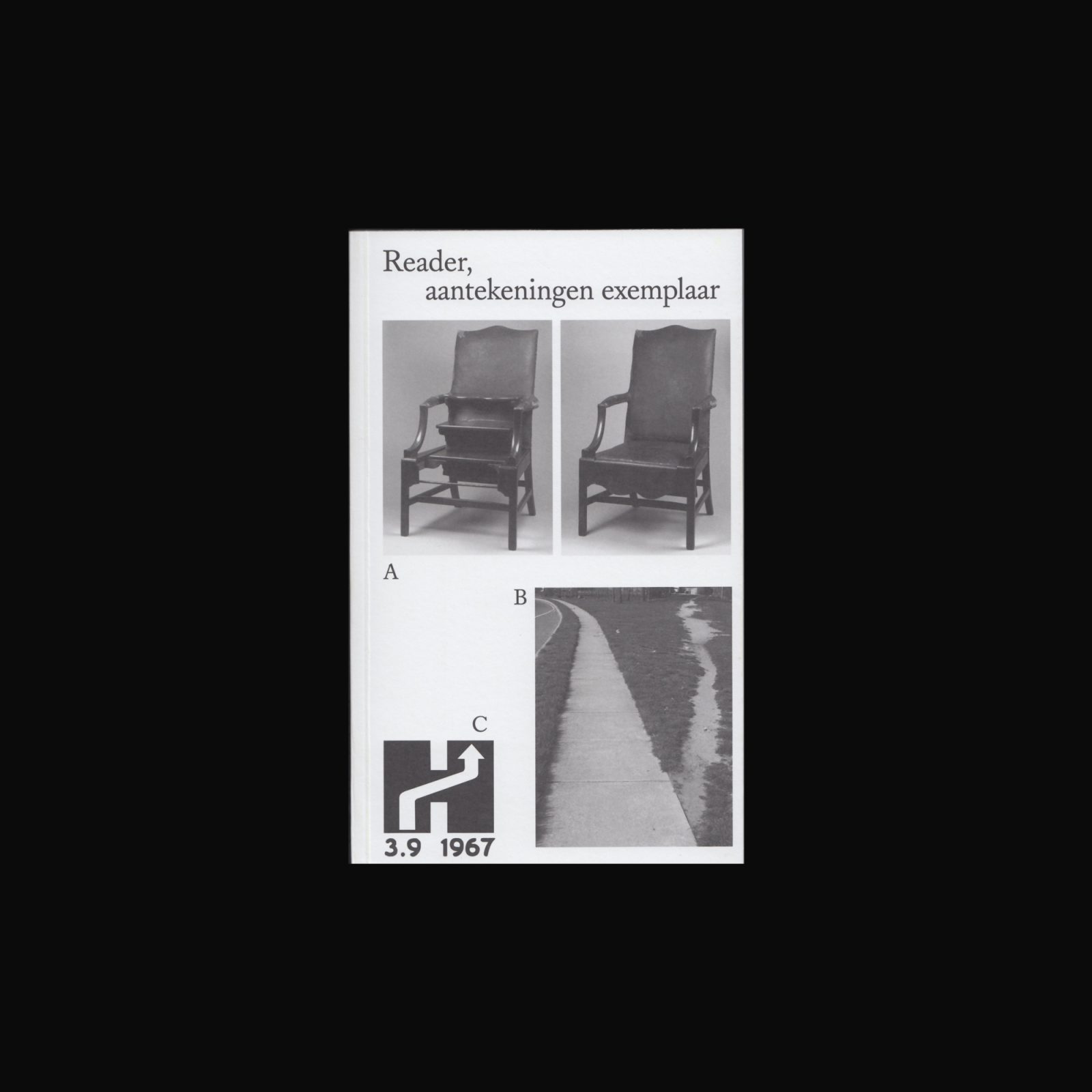
WT Reader: Reader, Aantekeningen Exemplaar (bookmark)
Published by Werkplaats Typografie, Arnhem, 2017, card (b/w ill.), 12 × 6 cm, English
Price: €1

Produced to accompany WT Reader: Reader, aantekeningen exemplaar, 2017, edited and designed by Ronja Andersen and Nerijus Rimkus.

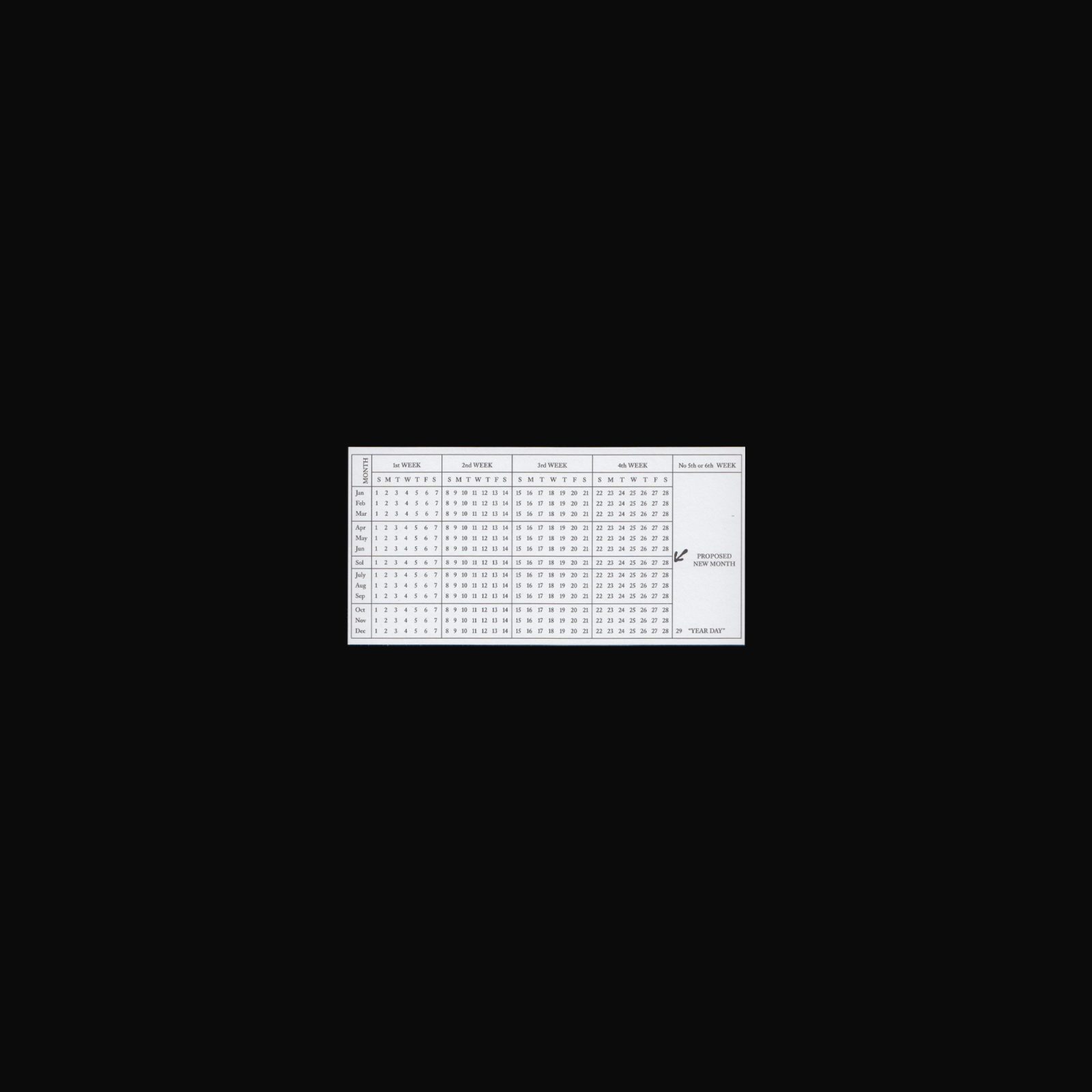
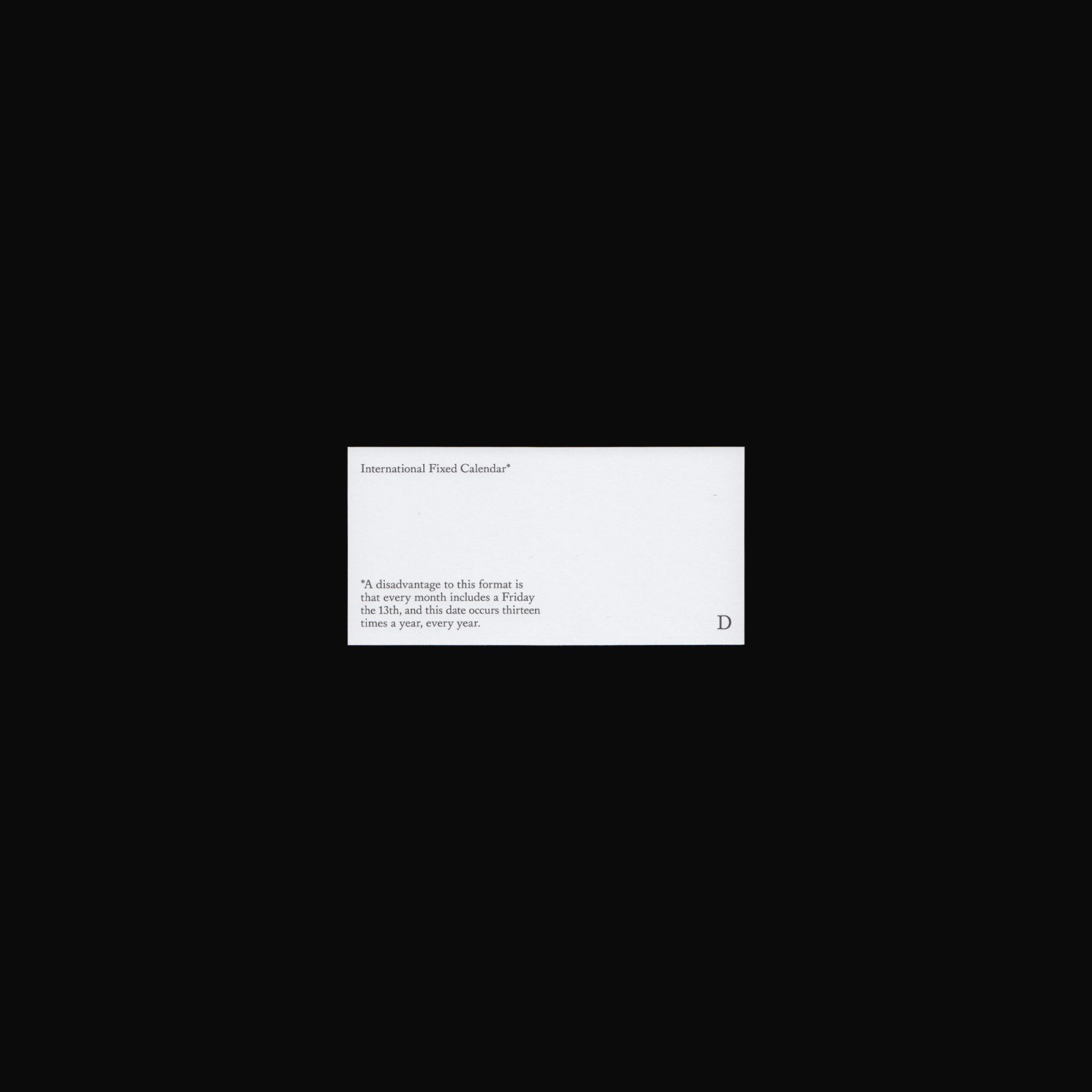
Featuring Moses Bruine Cotsworth and the International Fixed Calendar. Cotsworth’s. Cotsworth’s interest in calendar reform began when he was working at a railroad company and found that monthly accounting was greatly complicated by the fact that months did not divide evenly into weeks. He devised what is now known as the International Fixed Calendar, a solar calendar in which each of 13 months has 28 days.

#2017 #nerijusrimkus #ronjaandersen #werkplaatstypografie
Ellipsis after Closure
Nicha Keeratiphanthawong & Tabea Nixdorff
Published by Nicha Keeratiphanthawong & Tabea Nixdorff, Arnhem, 2020, 132 pages (b/w ill.), 16 × 22 cm, English
Price: €24 (Out of stock)

Following endless digital threads of information and being in constant touch with ‘hardware,’ it is easy to forget one’s bodily presence and situatedness. Weavings, just like computer coding, are complex automated nettings. Only the point of rupture—a dropped stitch, like a bug in the code, a systemic error—redirects the attention outside of the machine by requesting a manual intervention.

To experience a gesture of repair and an analogue form of ‘networking,’ as a literal and tactile activity, we initiated two hole mending meditations conducted online, with participants at home, to relax the senses while focusing on fixing holes in garments and touching soft textiles. To feel the impact each detail has on a structure as a whole: disruptions in the weave of a garment cause holes to grow. By tracing the dropped stitches and patching up obvious ‘bugs,’ we remediate and re-activate unappreciated clothes without erasing traces of our bodies inhabiting them.

#2020 #nichakeeratiphanthawong #tabeanixdorff #werkplaatstypografie
Karel Marten OASE/
Published by The Narrows, Melbourne, 2011, foldout poster (colour & b/w ill.), 10 × 21 cm (folded) 30 × 42 cm (unfolded), English
Price: €6

Poster/invitation produced on the occasion of KAREL MARTENS OASE/, 6–21 April, 2011, Faculty Gallery, Monash University, Melbourne. Curated by Warren Taylor.

The exhibition focused on Martens contribution to the graphic style of OASE, Journal for Architecture. From 1990 (Issue 28) Martens took over the art direction of the journal, often working with students from the Werkplaats Typografie—an experimental typography school he founded in 1998 with Wigger Bierma. What began as a student magazine, evolved into an international professional journal in which a reflective and critical approach to architecture, urban design and landscape architecture is the mainstay. Recently celebrating its 75th issue, the success of OASE is, in part, due to Martens refined graphic statement, often absorbing his print and typographic experiments and upholding the dialogue between graphic design and architecture.

More information on the exhibition can be found here.

#2011 #ephemera #karelmartens #oase #poster #thenarrows #warrentaylor #werkplaatstypografie
Michel Foucault Letters
Kevin Immanuel
Published by Werkplaats Typografie, Arnhem, 2009, 16 pages, 15.4 × 22 cm, English
Price: €7

Michel Foucault Letters documents artist Kevin Immanuel’s ongoing project archiving the supposed correspondence between the famous philosopher and a number of galleries and art institutions throughout Europe, North America, and China. The letters were, in fact, written by Immanuel himself, both as a literalization of Foucault’s emphasis on the importance of cultivating an “ironic stance” toward one’s present situation (in Immanuel’s case, the crisis of being a young artist trying to strike up a meaningful discourse with art institutions), and as a poignant critique of the relationship between art institutions and their patrons. Each letter contains a polite request to become a member of the institution, offers a monetary donation, and actively attempts to initiate a critical dialogue with the institution about its programming and exhibitions.

#2009 #werkplaatstypografie
Best Book, Don't Care or, Poor Form from Fringe Areas
Quinn Latimer
Published by Werkplaats Typografie, Arnhem, 2014, 22 pages (b/w ill.), 12 × 19 cm, English
Price: €7 (Out of stock)

“Best Books” is the subject of an annual workshop at Werkplaats Typografie, Arnhem. “Best Book, Don’t Care or, Poor Form from Fringe Areas” resulted from the 2013 workshop led by Sophie Nys in collaboration with the participants of Year 13 and Year 14. Designed by Roland Früh, Sophie Nys & Yin Yin Wong.

#2014 #quinnlatimer #werkplaatstypografie
WT reader: Reader, aantekeningen exemplaar
Published by Werkplaats Typografie, Arnhem, 2017, 322 pages (colour & b/w ill.), 11.8 × 19 cm, English
Price: €15 (Out of stock)

Authors: Ronja Andersen, Danielle Aubert, Joel Colover, Valentina Desideri, Jason Dodge, Olya Domoradova, Paul Elliman, Rosie Eveleigh, Eloise Harris, Sarah Käsmayr, Maxine Kopsa, Raimundas Malasauskas, Robert Milne, Josse Pyl, Nerijus Rimkus, Charlotte Taillet, Maud Vervenne, Caroline Wolewinski.

As part of Speelplaats, a parallel program of Werkplaats Typografie, participants challenged what was being offered in the school’s curriculum by introducing improvements or suggesting alternatives. Reader, aantekeningen exemplaar brings together these contributions made to the Speelplaats program alongside other like-minded initiatives by participants, guests and tutors in the shape of examples as well as reference texts.

Edited and designed by Ronja Andersen and Nerijus Rimkus.

#2017 #danielleaubert #eloiseharris #jasondodge #joelcolover #jossepyl #maudvervenne #maxinekopsa #nerijusrimkus #olyadomoradova #paulelliman #raimundasmalasauskas #robertmilne #ronjaandersen #rosieeveleigh #sarahkasmayr #valentinadesideri #werkplaatstypografie